


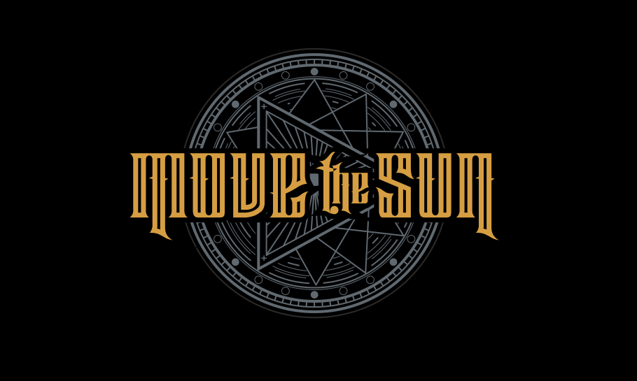
The logo for Move the Sun Metal Band was meticulously crafted to embody the raw energy and intensity of the band’s music. The design incorporates angular shapes and a rugged texture, symbolizing strength and the band’s relentless spirit.
A dark, moody color palette, featuring deep reds and metallic tones, enhances the edgy vibe, while the typography is heavy and stylized, capturing the essence of the metal genre. The combination of these elements creates a striking visual identity that resonates with fans and represents the band’s commitment to pushing boundaries in their sound and artistry. This logo serves not only as a brand mark but also as a symbol of empowerment and unity within the metal community